Yes, your race website needs a decent map.
Every prospective runner visiting your website wants to know the experience your race provides. How is your website communicating that?
A description helps introduce a viewer to your race. But every race has a glowing description of itself. Let’s be real, this is mostly glossed over. Perhaps you have variety of pictures up. That can help, especially if the pictures are well shot by a photographer. Photography can capture the allure of a race with scenery and facial expressions. How about a clean, professional website? Definitely. It communicates professionalism, which could translate into a runner sensing that you run an organized race.
While the points above help, they all miss where the actual work is done and the experience is felt: on the course. Runners want to know what they are running and where they are running. To their extreme frustration, countless race websites ignore the importance of providing clear and coherent course information. If your site doesn’t have this information, you are greatly increasing your chances that runners will move on to another race.
You can’t just put up any old map to solve this problem. A bad map is almost worse than no map at all. Take this example:
This is a real course map from a popular trail race. It is completely illegible. All you can discern is that there are mountains. Those with eagle-eyes may make out the blue line and guess that it’s the course. But maybe it’s a river?
Another frequent species of map you may find on race websites is the “theme-park” map. Here – counterintuitively – the race director has actually spent a not-insignificant amount money having a designer prepare a map:
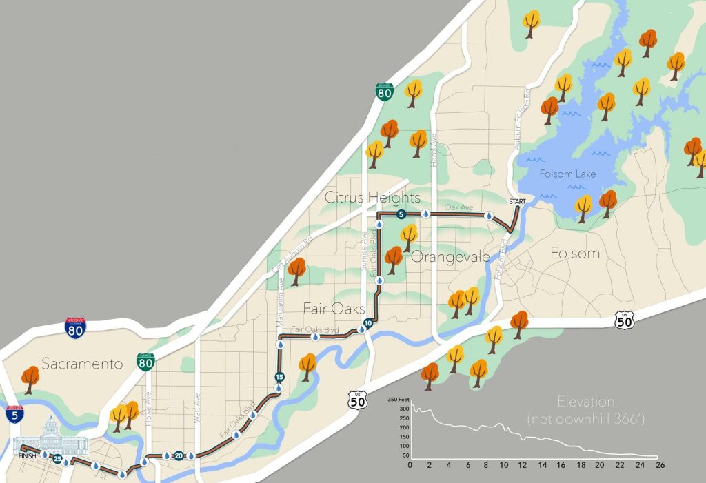
This does have a few things going for it. It looks great, and thus does contribute to an aura of professionalism and organization. But it does not provide anything meaningful about the course. At what distance are the aid stations? Where exactly is that hill?
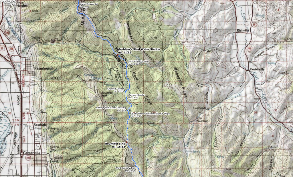
You need an interactive map to best communicate the experience of your course. There is no substitute. A proper interactive map allows your users to, at minimum:
- Track elevation along the course.
- Provide point of interest information about water and/or aid stations.
- Allow users to scroll and zoom to focus on areas of the map.
- Export the course to a GPX file.
At HelloDrifter, we felt the pain of runners everywhere and transformed that into professional, hyper-customizable, feature-rich course maps that anyone can make and embed on their website.
Play with this map for 30 seconds and you will see it meets all the above minimum requirements. But we have done much more. Click the “info” icon to get surface detail information. Another button gives mile markers. See the terrain in “3D”. Or project the elevation chart onto the course.
And setting up a map like this on HelloDrifter is no different than any other mapping site. You just add your course by uploading a GPX (or point-and-click if you wish). We do the number-crunching, elevation calculations, surface-details fetching automatically. And because we know every race is different, we made sure that our maps are fully customizable. Every color can be changed. Every feature can be adjusted or removed to best suit your race.
Give it a try for free. You only pay when you’re ready to share the map with your runners on your site.